Instagram with Material Design concept is getting real - The Summary
This is just a summary of series of posts showing Android implementation of INSTAGRAM with Material Design concept. If you read previous posts about InstaMaterial project, you can skip this one.
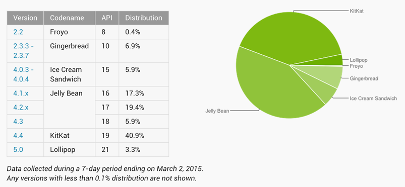
A couple months ago I started to work on project which implements almost all visual effects showed in the video created by designer Emmanuel Pacamalan. This video presents new Google design guidelines - Material Design. Everything looked great, but some people started to worry about the bigges problem of Android platform - fragmentation. Material Design was presented with the newest Android system - 5.0 Lollipop which adoption rate looks like below:

Still less than 5% at this moment (first half of March 2015). Not so good, right?
But actually it was the main reason to start this series. I wanted to prove that we can create beautiful and smooth application which will work on almost all available devices. That’s why InstaMaterial project supports all systems versions, starting from 4.0 Ice Cream Sandwich. Thanks to this our app can work on more than 90% of all Android devices (according to the presented statistics).
To be clear, not every presented effect is available for both Android 4.0 and 5.0 platforms, but the difference is almost invisible.
One more time, take a look at the concept video:
And here are the results of our work:
Did you find some similarities? 😃
Informations and links for InstaMaterial project
The most recent app is available here as an .apk file. I cannot put it into Google Play store because of violation of the intellectual property, what is completely understandable.
This is an open source project and full code is available on Github repository. Project isn’t 100% bugs free, so feel free to contribute.
List of posts
Here is the full list of series posts:
- Instagram with Material Design concept is getting real - project init configuration, feed layout and intro animation
- InstaMaterial concept (part 2) - Comments window transition - custom activity transition for comments view
- InstaMaterial concept (part 3) - Feed and comments buttons - ripples, buttons effects
- InstaMaterial concept (part 4) - Feed context menu - animated context menu for feed items
- InstaMaterial concept (part 5) - Like action effects - animation techniques, ObjectAnimator and AnimatorSet usage
- InstaMaterial concept (part 6) - User profile - reveal activity transition for user profile, RecyclerView items animations
- InstaMaterial concept (part 7) - Navigation Drawer - patterns for NavigationDrawer implementation
- InstaMaterial concept (part 8) - Capturing photo - quick tour and sample implementation of camera
- InstaMaterial concept (part 9) - Photo publishing - custom view drawing
And that’s all. I hope you enjoyed my work. One more time thank you for your comments, kind words and support. See you soon! 😃
Author: Miroslaw Stanek
If you liked this post, you can share it with your followers or follow me on Twitter!