InstaMaterial meets Design Support Library
A couple months ago I started InstaMaterial series. The goal was simple - to prove that it is pretty straightforward to implement all those fancy animations and UI effects showed in Material Design guidelines. Now it becomes even easier - Google gave us Android Design Support Library which provides all the most important UI elements introduced in Material Design. In this post I’d like to update InstaMaterial source code from custom views implementantations to those provided by this library.
Before we start updating everything
Does design support library means that all code described here is out of date? Not at all. Yes, it’s always better to use official implementations (is it?), especially with standard use cases. Provided implementations mean also that someone cares about the code for us. We don’t have to think about Floating Action Button compatibillity between Kitkat, Lollipop and M___. Thanks to this we save a lot of lines of code which can be used for even fancier stuff (or just code becomes more readable).
But hey! There is one important thing - on the other side, there are also programmers like us. They also make mistakes. They cannot predict all possible use cases. And what is very important - sometimes is better to know what is under the hood - how things work from scratch. Just for better understanding how “system works”.
Meet desing support library
Currently there is a lot of posts which describe new design support library:
- Exploring the new Android Design Support Library
- A couple of posts on Antonio Leiva’s blog
- …and probably much more
That’s why this post will be only a quick overview of transition things from custom implementations to those provided by Design Support Library. By the way we’ll see how many lines of code we’ll save.
NavigationView

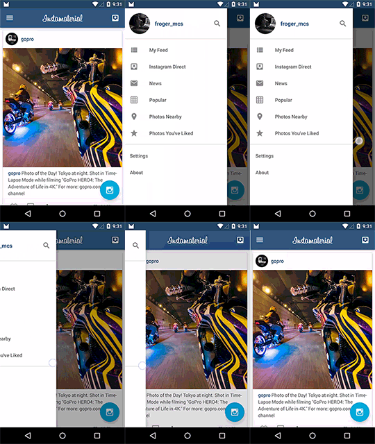
Material design rules for default Navigation drawer are very clear. Now thanks to NavigationView whole menu can be implemented in /res/menu/{filename}.xml file. Instead of custom implementation of views hierarchy all we need to do is to use this code in our Activity:
NavigationView has two important properties: app:headerLayout and app:menu. First one defines custom view layout which will be placed as a header of our navigation menu. The second one defines resource which provides menu elements. This is how menu implementation looks like in our app:
In our app we also defined BaseDrawerActivity which automatically adds navigation drawer to every activity which inherits from it. Here is the source code of BaseDrawerActivity.
Finally take a look at this commit. This is how much lines of code we saved. Custom navigation drawer view, menu adapter and layouts became unnecessary.
Floating Action Button

Floating Action Button is probably the most recognizable UI element introduced in Material Design guidelines. But until now its implementation wasn’t so obvious. Circular shape, shadow (also with curcular shape), ripple effect, elevations. Now everything is provided by library. All we have to do is to put FloatingActionButton directly in .xml layout file:
And that’s all. We don’t need two different drawables for Lollipop and older system versions. Don’t need to make workarounds for circular shadow etc. Until we don’t want to customize it in unusual way all is done for us.
It is worth mentioning that default implementation of FloatingActionButton has two sizes - mini and normal (default) defined by: app:fabSize="mini" and app:fabSize="normal" attributes.
CoordinatorLayout
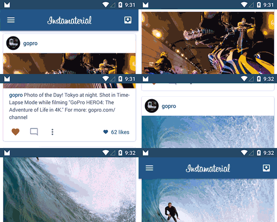
This is something that many Android developers missed - especially those who worked with interactive layouts. CoordinatorLayout is a new ViewGroup layout which help to coordinate interaction between its subviews. In practice probably the most common use case for it will be interaction between ScrollView and any other view(s). This is also what we start with - we would like to hide Toolbar when feed scrolls down and show it for scroll up.
AppBarLayout
AppBarLayout is another ViewGroup which can help us with this. It gives us a couple default behaviors for toolbar which can be used to interact with any scroll view. Here is sample views hierarchy which shows how we could use AppBarLayout in connection with CoordinatorLayout:
Here we have a couple important things:
app:layout_scrollFlags="scroll|enterAlways"in Toolbar means that this child ofAppBarLayoutwill react for scroll event (view will be scroll in direct relation to scroll events) and view will scroll on any downwards scroll event (better known as “quick return” pattern).app:layout_behavior="@string/appbar_scrolling_view_behavior"in RecyclerView means that this scroll view will send scrolling events toAppBarLayoutchildren.
Result

Easy, isn’t it? Now check what else you can do with the rest of scrollFlags.
Snackbar

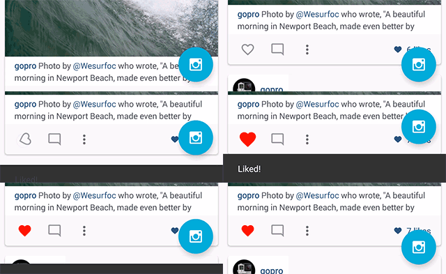
Snackbar was introduced as a more mature Toast implementation. It’s also used for short messages but can be provided with additional action (e.g. “Undo” for current action). Moreover it can interact with other views nested in CoordinatorLayout.
And the costruction is as simple as in Toast:
First parameter of make() method is view to find a parent from. It means that Snackbar will walk up the view tree trying to find a suitable parent. If it will be CoordinatorLayout Snackbar will be able to interact with e.g. FloatingActionButton. Also it will become dismissable by swipe.
TabLayout

Finally Google gives us modern implementation for tabbar - with horizontal scroll, icons or texts, easy tab indicator customization, gravity for tabs, ripple effects etc. And this is TabLayout, nothing more, nothing else:
CollapsingToolbarLayout
At the end we’ll take a look at CollapsingToolbarLayout. Since Toolbar is more generic solution than old ActionBar there are a lot of ui effects connected with this view - parallax, dynamic title size and position, expanding/collapsing content and much more. And in short this is what CollapsingToolbarLayout gives us.
One more time it is all about proper .xml layout configuration - no Java code at all.
Here is the implementation which replaces our UserProfileAdapter (irrevelant lines were hidden):
Full source code of activity_user_profile.xml is available here.
Important things?
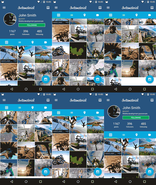
app:layout_scrollFlags="scroll|exitUntilCollapsed"means that not pinned children will be collapsed until we scroll to the top. Pinned views (our Toolbar withapp:layout_collapseMode="pin") will remain untouched.app:layout_collapseMode="parallax"causes that our view will be collapsed in Parallax-way.app:contentScrim="?attr/colorPrimary"inCollapsingToolbarLayoutmeans that collapsed view will be covered by this particular color.
Now take a look at the final effect:

And this is all for today. We’ve just updated InstaMaterial with new views and effects like Snackbar, FloatingActionButton, TabLayout, CoordinatorLayout, AppBarLayout and CollapsingToolbarLayout. All of them were provided from Android Design Support Library.
Source code
Full source code of described project is available on Github repository.
Author
Miroslaw Stanek
Head of Mobile Development @ Azimo Money Transfer
If you liked this post, you can share it with your followers or follow me on Twitter!