InstaMaterial concept (part 2) - Comments window transition
This post is part of a series of posts showing Android implementation of INSTAGRAM with Material Design concept. Today we’ll implement transition between feed and comments Activities (showed between 9 and 13 second in concept video). We’ll skip buttons effects (ripples, send-complete animation etc.) and focus only on enter and exit animation for comment’s Acitvity.
This is the final effect described in today’s post (for both Android Lollipop and pre-21 versions):
Initial config
Let’s start from adding boilerplate and less important stuff to our previously created project. We have to add:
- Picasso library for asychronous pictures loading (used in comments list, for users avatars),
- new Activity for comments with style and declaration in
AndroidManifest.xmlfile.
Also we create layout for that Activity. Everything is almost the same like in MainAcitvity, except bottom components for adding comments. One more time we use Toolbar, RecyclerView and some additional stuff. Everything is pretty straightforward and doesn’t require additional comments:
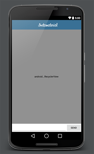
Next, create layout for item in comments list:
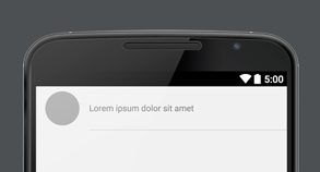
Snippet for rounded background used in comment’s avatar:
And the last thing, let’s handle onClick on bottom part of feed item which should open CommentsActivity for current photo. For now we use whole bottom part of mocked view, but in close future we’ll replace this with real buttons. In this step we have to add onClick listener in RecyclerView adapter. This listener will be set on bottom view in every single item presented in list. Also we’ll create simple interface for integrating MainActivity with our adapter. How is it look in practice?
FeedAdapter class (changes only):
MainActivity class (changes only):
In case we missed something, here is full commit with onClick on item in RecyclerView adapter.
…and that’s all for initial config.
Enter transition
At the beginning we’ll create enter transition. Basing on concept video, here is the list of effects which we want to achieve:
- Static Toolbar - new Activity should be opened without ActionBar movement (we want to cheat user that he is still on the same window)
- Comments view should be expanded exactly from the place where user taps (no matter what is the current scroll position of feed)
- Comments items should be displayed one after another, right after expand animation will finish.
Static Toolbar
The simplest step in this post. Thanks that Toolbar looks similar on MainActivity and CommentsActivity all we need to do is to disable default transition between Acitvities. After that new window will be drawn on top of the previous one without any movement. And it will imitate static Toolbar effect. This is how it looks in code:
By calling overridePendingTransition(0, 0); we disable exit animation (for MainActivity) and enter animation (for CommentsActivity).
Expanding CommentsActivity from tapped place
Now we want to create expand animation which can be started from any (vertical) location on the screen. This animation includes two parts:
- Expanding background
- Showing content
Before we start coding our animations we have to make CommentsActivity translucent. Otherwise expand animation for our background will be perfromed on top of default window background, instead of MainAcitvity view. It’s because every activity has windowBackground property defined in currently used Theme. If we want to disable it and make our Acitivty translucent we have to modify style like below:
Here is the difference:


Now we can create expand effect. First of all we have to get initial Y position for animation. In our example we don’t have to know the exact position of tapped place (animation will be so fast that user won’t notice that starting point isn’t super accurate). We can use Y position of tapped view and pass it to CommentsActivity:
Next, in CommentsActivity implement expand animation for background. For this we can use simple Scale animation (we don’t have any visible content in that moment, so no one will know that we are stretching background instead of expanding it 😉). Don’t forget to use setPivotY() method for setting the right initial position.
As it’s showed above our animation will be started once, after we open CommentsActivity. Thanks onPreDrawListener animation will be performed at the moment when all views in the tree have been measured and given a frame, but drawing operation hasn’t started yet.
In code above we have both, expand background and showing content animations implemented. And this is how it looks in practice:
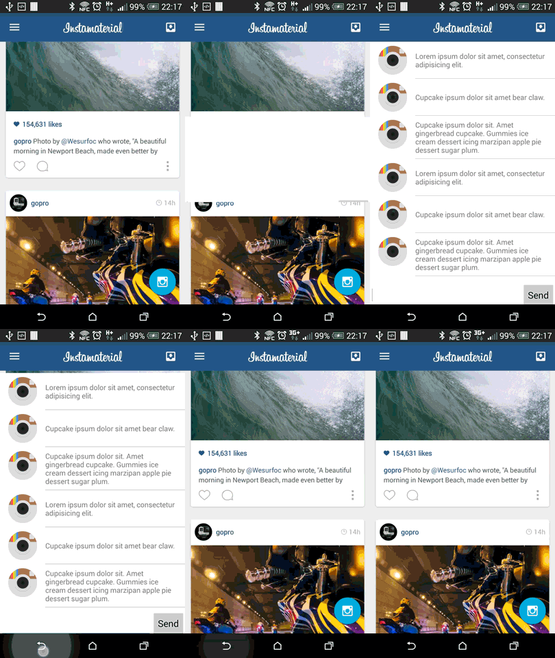
Still something is missing, right?
Now we have to prepare animation for every element on our comments list. It’s pretty straightforward, but we have to keep in mind some important things:
- Every item’s animation should be delayed a little. Otherwise all animations will be performed at the same time and user will see “one” animation for whole content instead of animations for every single item.
- Adapter should have possibillity to lock animation, because we don’t wont to animate items while user is scrolling content.
- Also we have to provide method for temporary unlock and perform animation for single item (i.e. for adding new comment)
For now CommentsAdapter can look like below:
For displaying avatars we use Picasso library with CircleTransformation. Thanks RecyclerView and his adapter we can use notifyItemInserted() method (line 80) which performs default animation for newly inserted item. The rest of code is pretty simple.
This is how it’s used in CommentsActivity class:
Items animations are blocked when user starts dragging RecyclerView (they are temporarily unlocked when the user adds a new entry).
And that’s all. Enter transition for CommentsActivity is finished.
Exit transition
The last thing that we have to implement is exit transition. Basing on concept video, there is nothig special to do. We have to create transition animation which slides out our Acitivty (to the bottom). We have to remember that we cannot move our Toolbar. That’s why we use overridePendingTransition(0, 0); again, and animate background view:
And that’s all! We’ve just finished second step of InstaMaterial concept implementation. In next post I want to focus on details which we currently missed.
Source code
Full source code of described project is available on Github repository.
Author: Miroslaw Stanek
If you liked this post, you can share it with your followers or follow me on Twitter!