Instagram with Material Design concept is getting real
A couple months ago, after Google presented Material Design - new design guidelines for mobile and web both, designer Emmanuel Pacamalan created concept video showing what Instagram for Android would look like after aplying Material Design rules:
While it’s only graphic prototype some people started to wonder if it’s possible to implement this in real application in relatively simple way. Well, it is. And not only on devices with the latest Android OS - Lillipop. The truth is that we can achieve most of showed graphics and animations effects for a couple years, since Android 4 was released.
Regarding to this I want to start new series of posts in which I’ll show you how to reproduce INSTAGRAM with Material Design on real Android devices. Of course, for obvious reasons we’ll create only front-end mockup for this application, but we’ll try to reproduce as many details as it’s possible.
Starting the project
In this post I’d like to reproduce first 7 seconds of showed concept. I think it’s enought for the first time, regarding to that we also have to prepare and configure our project.
I’d like you to remember that all solutions which I’ll show you are not the only possible ways - they are my favorite ones. Also I’m not a graphic designer so all images used in our project are taken from public resources (mainly from Material Design avaiable on it’s resources page).
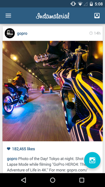
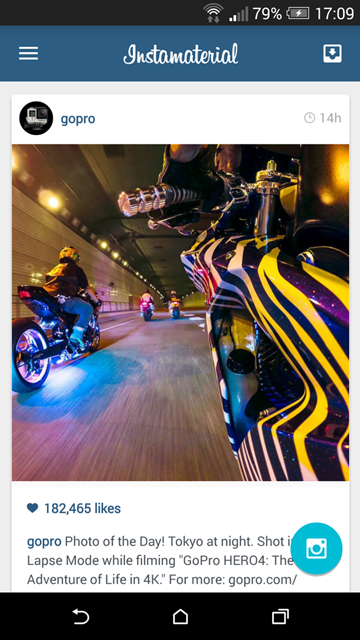
Ok, here you have screenshots and two short movies (taken on Android 4 and 5) showing our final effects:
Preparing the app
In our project we’ll use some popular tools and libraries used for Android development. Not all of them we’ll use in this post, but I’d like to prepare project as much as it’s possible to avoid dealing with build files in close future.
Initial project
First of all we have to create a new Android project. For this I used Android Studio and gradle build system. Minimal version of Android SDK is 15 (Android 4.0.4).
After that I’ll add some dependencies and utils. There is nothing special to talk about so here you have full source code of build.gradle and app/build.gradle files:
In short, what we have here:
- Bunch of support libraries (CardView, RecyclerView, Palette, AppCompat) - I’d like to use as newest UI components as we have. Of course It’s not the problem if we want to use ListView, ActionBar or simple View/FrameView instead. But why? 😉
- ButterKnife - views injection, for cleaner code (i.e. we don’t have to write
findViewById()to get Views references but it also provides more powerful methods likeonClick()injections etc. - Rebound - we won’t use this library in current post, but I’m sure that we’ll do it in close future. It’s powerful library from facebook which can help you to make your animations even more natural (it provides tools for spring animations - just check how animations work in Chat Heads from facebook Messenger to make you sure that you want to use it in your next project 😉)
- Timber and Hugo - not necessary in this project. I’m using them for logging only.
Image resources
In this project I used a couple of icons from Material Design resources. Also I made screenshots of GoPro profile on Instagram to provide mockups of our feed. App icon is taken from INSTAGRAM with Material Design video. Here is complete bunch of images used in project (whole drawable-xxdpi directory for now).
Styling
Let’s start from defining default style for our app. The simplest way for providing base of Material Desing styles for both Android 4 and 5 is to inherit from Theme.AppCompat.NoActionBar or Theme.AppCompat.Light.NoActionBar. Why NoActionBar? Becase new SDK (and compatibility library) provide us a new way for implementing ActionBar pattern. In our example we’ll use Toolbar widget because of simple reason - it’s better and more flexible solution then ActionBar. I won’t dig into the details. Instead you can read it on Android Developers Blog in one of the latest posts about AppCompat v21.
Basing on concept movie we’ll define three base colors for our AppTheme:
More details about what these colors are, you can find in Material Theme Color Palette documentation.
Layout
Our current project will be build from 3 main layout elements:
- Toolbar - top bar with navigation icons and application logo
- RecyclerView - used for showing feed
- Floating Action Button - simple ImageButton which is implementing new action button pattern introduced in Material Design.
Before we’ll start to implement our layout, let’s define some default values in res/values/dimens.xml:
These dimensionas are based on values introduced by Material Design guildelines.
Great, now we can implement layout for our MainActivity:
Some explanation about code above:
- The greatest thing with
Toolbaris that now it’s a part of activity’s layout implementation and it’s also extending ViewGroup, so we can put some UI elements inside (they will use remaining free space). In our example we used it for putting logo image. Also whileToolbaris more flexible widget than ActionBar, now we have to do more things by our hands. So i.e. we have to set background to ourcolorPrimary(otherwise Toolbar will be transparent). RecyclerViewis very simple to implement in XML file, but until we don’t configure it properly in java code our app won’t start throwingjava.lang.NullPointerException(it’s connected with not configured LayoutAdapter which is resposible for arranging items inside RecyclerView).- Elevation param doesn’t work for pre-21 Android. So if we want to show that our Floating Action Button really floats we have to implement different backgrounds for Android Lollipop devices and older ones.
Floating Action Button
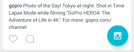
To simplify our work on FAB we’ll use a little different styles for Android Lollipop and pre-21 devices:
- FAB for Android v21:
- FAB for Android pre-21
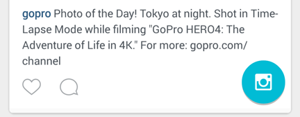
To achieve this we have to create two different XML files for button’s background: /res/drawable-v21/btn_fab_default.xml for Android Lollipop and /res/drawable/btn_fab_default.xml for previous Android versions:
Also we have to add two colors to our res/values/colors.xml file:
<color name="btn_default_light_normal">#00000000</color>
<color name="btn_default_light_pressed">#40ffffff</color>
As you can see making shadow effect for pre-21 device is a little tricky. Unfortunatelly there is no simple way to achieve “real” shadow via XML file. Other options are to use prepared earlier shadow image or do it by using Outline class directly in Java code (hint for creating fab shadow).
Toolbar
Now let’s finish our Toolbar. We have background and application logo so right now only navigation and menu icons are missing.
Unfortunatelly XML value app:navigationIcon="" doesn’t work while android:navigationIcon="" works only in Android Lollipop. That’s why we have to setup navigation icon from java code:
toolbar.setNavigationIcon(R.drawable.ic_menu_white);For menu icons we can use standard Options menu defined via res/menu/menu_main.xml:
And inflated from Activity source code:
@Override
public boolean onCreateOptionsMenu(Menu menu) {
    getMenuInflater().inflate(R.menu.menu_main, menu);
    return true;
}
Now everything should works but as I mentioned on twitter, there is some inconsitency in Toolbar onClick selectors:
To fix this we have to do a little more work. First of all let’s create custom view for our menu item (res/layout/menu_item_view.xml):
Now we have to create onClick selectors, for Android Lollipop (with ripple effect) and Android pre-21:
Full list of colors in our project now should looks like this:
Last thing we should do is to put our custom view into menu item. We can do this in onCreateOptionsMenu() method:
@Override
public boolean onCreateOptionsMenu(Menu menu) {
    getMenuInflater().inflate(R.menu.menu_main, menu);
    inboxMenuItem = menu.findItem(R.id.action_inbox);
    inboxMenuItem.setActionView(R.layout.menu_item_view);
    return true;
}
And that’s all. Our Toolbar is ready. Also onClick selector for menu item works as it should:

Feed
Last thing we should implement is feed, built on RecyclerView. Right now we have to setup two things: layout manager (RecyclerView has to know how to arrange items) and adapter (to provide items).
First thing is straightforward - while our layout is simple ListView we can use LinearLayoutManager for items arragement. For the second one we have to do more work, buth there is no magic to deal with.
Let’s start from defining list item layout (res/layout/item_feed.xml):
What we’ve got there:
CardView- wrapper for our list item with rounded corners and shadow outline (which works on Android 21 and pre-21).ImageViewsfor feed elements mockups (SquaredImageView is our implementation of ImageView which has square dimensions).
Also FeedAdapter is pretty simple:
Nothing special to talk about.
To put everything together in our MainActivity class we have add this method:
private void setupFeed() {
    LinearLayoutManager linearLayoutManager = new LinearLayoutManager(this);
    rvFeed.setLayoutManager(linearLayoutManager);
    feedAdapter = new FeedAdapter(this);
    rvFeed.setAdapter(feedAdapter);
}
And that’s all for now. Here is full source code of MainActivity class:
In case you missed something here you have commit for whole project which we have in this moment.
When you build and run app on your device you should see these screens:
- Android Lollipop

- Android pre-21

Animations
The last and the most important things to implement are intro animations. Take a look at concept video again and let’s list all animations performed on main Activity’s start. In my opinion we can split it for two steps:
- Showing Toolbar with inner elements
- Showing feed and floating action button after Toolbar animation will finish.
Toolbar items animations are performed one after another in short period of time. The main problem with implementation of this animation is navigation icon - the only element which we cannot animate. The rest is pretty straightforward.
Toolbar animation
First of all we want to animate our application only when we start it (not after i.e. we’ll rotate our device). Also keep in mind that we are animating menu item which isn’t available in onCreate() method (we are initializig it in onCreateOptionsMenu()).
Let’s add pendingIntroAnimation boolean value into our MainActivity. We’ll initialize it inside onCreate() method:
//...
if (savedInstanceState == null) {
    pendingIntroAnimation = true;
}
and utilize in onCreateOptionsMenu():
@Override
public boolean onCreateOptionsMenu(Menu menu) {
    getMenuInflater().inflate(R.menu.menu_main, menu);
    inboxMenuItem = menu.findItem(R.id.action_inbox);
    inboxMenuItem.setActionView(R.layout.menu_item_view);
    if (pendingIntroAnimation) {
        pendingIntroAnimation = false;
        startIntroAnimation();
    }
    return true;
}
Thanks that startIntroAnimation() will be invoked once, after we start our application.
Now it’s time to prepare animation for Toolbar and its inner items. It’s also pretty strighforward. It’s good to keep in mind that, in general, animations are composed from two steps:
- preparation - here we have to setup initial state for every animated element. If i.e. we want perform expand animation, here we have to be sure that our item is hidden.
- animation - in this step our views are animated to final state or/and position.
Ok then, let’s try to implement both steps for Toolbar animation:
What we’ve got here:
- First of all hide all elements by translating them out of screen (in this step we’re hiding FAB also.)
- Animate Toolbar and inner items, one after another.
- After animation will finish, animate content (FAB and feed items).
Simple, right?
Content animation
In this step we want to animate two things: FAB and feed. While FAB animation is pretty simple (just do the similar actions like described above), animating feed items is a little tricky.
For this example the simples solution is to keep feed adapter empty and fill it in the moment when we want to animate items. And animate them directly in adapter, while items are created. How it looks like in real code? Take a look:
startContentAnimation()method:
FeedAdapterwith animated feed items
And… that’s all! If we build and run our project we have the final version showed at the beginning of this post.
In case you missed something, here is commit for our project with implemented animations.
Source code
Full source code of described example is available on Github repository.
Author: Miroslaw Stanek
If you liked this post, you can share it with your followers or follow me on Twitter!