InstaMaterial concept (part 3) - Feed and comments buttons
This post is part of a series of posts showing Android implementation of INSTAGRAM with Material Design concept. Today we’ll take care about some details which we skipped previously. It means that we are still on 9 to 13 seconds time period from the concept video.
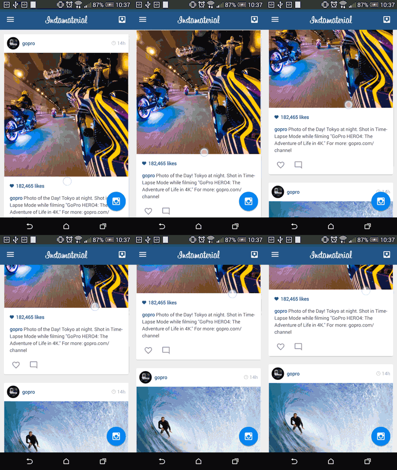
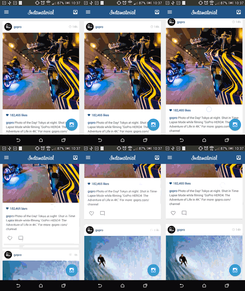
This is the final effect described in today’s post (for both Android Lollipop and pre-21 versions):
Initial config
Nothing special is happening here. We only need to add two images for buttons in feed element (like and comment icons) and modify current mock images. It was done in this commit. After that, but still before we’ll start to implement the new stuff, we have to work on…
Bugfixes and performance improvements
That’s right, even in small projects like InstaMaterial you can always find something to fix or to improve. The same is here.
Toolbar theme
First of all I missed the Toolbar styling. And that’s why selector for menu button (left button on the Toolbar) has default, dark version (screen below).

Inbox button (right button on the Toolbar) has light version because it uses custom view with selector defined by android:background="@drawable/btn_default_light" in menu_item_view.xml.
This inconsistency appears only in Android Lollipop and the fix is quite simple. All we need to do is to add single line to Toolbar in activity_comments.xml and activity_main.xml:
app:theme="@style/ThemeOverlay.AppCompat.Dark.ActionBar"
Thanks to this line all items hosted inside Toolbar view will have default styling taken from Dark.Actionbar theme.
By the way, if you are interested in styling and theming in Android and want to know what are the main differences between them, there is worth metioning article - Styling Views on Android (Without Going Crazy).
After we’ll apply new them menu selector should look like below (Lollipop only):

RecyclerView elements preloading
Another problem I found in project is feed scroll smoothness right after we launch the app. Almost every time we scroll to the second item, layout stutters for a while. Fortunately the reason of this problem is quite simple. As you probably know RecyclerView (and other adapter views like ListView, GridView etc.) uses recycle mechanism for reusing views (in short, system keeps in memory layout only for items which are visible on screen, and reuse them instead of creating new ones if you scroll it).
The problem with our project is that we have only one feed element visible on the screen after we start the application. When we start scrolling, there are no views to reuse by RecyclerView, so in the moment when we reach the second element it has to be layed out. Unfortunately it takes some time, so our RecyclerView stutters for this moment. After that scroll becomes smooth because we had at least two elements in memory to reuse (which we don’t need to create from scratch).
How to fix this?
In our example it’s pretty straightforward thanks to LinearLayoutManager which we use. All we have to do is to override getExtraLayoutSpace() method. According to the documetation, it should return amount of extra space (in pixels) that should be laid out by our LayoutManager:
This is how it looks in practice:
Before override getExtraLayoutSpace():

and after it:

Feed buttons
Let’s start with feed buttons (like and comments for now). As we can see on the concept video they have fancy, circle-shaped selector.

Ripples in Android Lollipop.
Selectors used in feed buttons are nothing more than the Ripple effect introduced in Android Lollipop. There are a lot of tutorials and blog posts about ripples so I don’t want to dive into this topic so deeply. here are a couple links:
- Ripples – Part 1 and Ripples – Part 2 from Styling Android blog
- Implementing Material Design in Your Android app from official Android Developers Blog
Ripple implementation in our example is short and simple:
res/drawable-v21/btn_feed_action.xml:
And this is how we use it in feed_item.xml as a buttons background (line 17 and 24):
Don’t use ripples in pre-21 Android version
I know that I promised to reproduce almost everything from the concept video, but sometimes it is better to not do something rather than do something which doesn’t meet the expectations. And so it is with the ripple effect in pre-21 Android versions.
Of course right now we have some libraries which mimic ripple effect on older Androids, but none of them work as it should. They need extra code (i.e. additional layout wrapper), don’t use native Ripple effect in Android Lollipop, have performance issues etc.
But why is so hard to copy Ripple effect into pre-21 Android?
Ripples - under the hood
Before Android Lollipop whole UI was managed in one “main” thread - UI Toolkit thread. Almost everyone knows ANR dialogs, the most of us faced with NetworkOnMainThreadException and knows the golden rule - move all long-running operations (networking, database access, image processing) to worker threads and handle only the results in UI thread. And everything would be ok except one rule from first sentence - whole UI have to be managed in main thread.
With more complex and rich apps layouts, The UI itself becomes much more demanding and needs more time for measure, draw and layout operations. And here is the problem. If we are in the middle of animation and start another UI task (like inflating layout for newly opened Acitvity) the problem is that both of these tasks are performed in the same thread, so that animation is going to stop while the activity launches.
Render thread introduced in Android Lollipop helps with these situation by breaking apart two processes of rendering. In short we have list of atomic animations created in UI toolkit thread and then we send them into render thread which exists separately. Thanks that it will continue to perform these atomic animations even if the UI toolkit thread is doing an expensive operations (like inflating an activity for example).
And actually this is how ripples work. They are executed in render thread, completely autonomous of the UI Toolkit thread, thanks that they cannot be interrupted or stopped even if the new activity window is coming up.
And that’s why there is no (simple) way to achieve ripple effect in pre-21 Android system.
Pre-ripple selector in older Android
Because wa cannot do ripples let’s make something similar. We create circle selector with enter and exit fade duration. Maybe it’s not as effecitve as ripples, but still looks ok. Here is an example:
And the implementation of res/drawable/btn_feed_action.xml:
Send comment button
Much more interesting for us is SendCommentButton. As you can notice on the concept video it has two states with simple translate animation between them and ripple onClick selector.

For this button we’ll use a couple Android elements:
- ViewAnimator as a base class for our button. It has one functionality which is the most interesting for us - it can perform enter and exit animations when switching between its child views.
- Custom view composed in .xml and inflated in code
<merge>tag for eliminate redundant view groups
Implementation
Ok, let’s start from the animations. Actually we need four of them - 2 (enter and exit) for Send state and 2 (enter and exit, but reversed) for Done state:
-
Send state:
- Slides out at the top:
- Slides in from the top:
-
Done state:
- Slides in from the bottom:
- Slides out at the bottom:
Now let’s implement layout for our button:
We used <merge> tag because our SendCommentButton will be view group for itself. Thanks that we can eliminate one redundant ViewGroup.
And the last thing - the implementation. For now we have only one requirement for our button - after we switch state to the STATE_DONE, it should switch it back to the SEND_STATE after two seconds.
The whole code is pretty straightforward:
init()method (line 29) inflates our previously created layout directly inside ourViewAnimator. By the way check this great article about proper Layout Inflation and its parameters which you probably didn’t care about before.onDetachedFromWindow()removesrevertStateRunnablecallback in case you scheduled one, but haven’t finished yet (i.e. you destroy the Acitivty before button state switches back).
The rest is quite simple. By invoking setInAnimation() and setOutAnimation() we switch animation for enter end exit action.
Great, we’ve just finished SendCommentButton implementation.
Design
The same as in feed action buttons, we have to prepare two different selectors for our SendCommentButton. For Lollipop version again we’ll use ripple effect (this time bounded in button frame). For pre-21 Android we’ll create standard version with pressed state and shadow emulated in the same way like FAB button described in the first post of this series.
Here is the code for both .xml files:
res/drawable-v21/btn_send_comment.xml:
res/drawable/btn_send_comment.xml:
Bonus - shake on error
At the end we’ll add one more functionality not showed in the concept video - shake animation in case comment text field will be empty. Here is the preview of this effect (it looks much better on the real device):

Implementation is pretty simple - we have to create shake animation and custom CycleInterpolator for repeating this animation. Everything is in a few lines of code:
res/anim/shake_error.xml:
res/anim/cycle_2.xml:
If we want to use it in code we have start this animation of View like below:
btnSendComment.startAnimation(AnimationUtils.loadAnimation(this, R.anim.shake_error));
And that’s all for today! Here is the last commit with our SendCommentButton usage (it’s only a boilerplate not worth mentioning). In the next post we’ll finally move on to the next period in concept video.
Source code
Full source code of described example is available on Github repository.
Author: Miroslaw Stanek
If you liked this post, you can share it with your followers or follow me on Twitter!